
Understanding Histograms – Low-Key And High-Key Images
Written by Steve Patterson. In the previous tutorial in this series on tone and color correction in Photoshop, we learned how to read and understand an image histogram, one of the most valuable and essential skills for editing, retouching and restoring images.
We learned that histograms start with black on the left and end with white on the right, with a gradual transition from shadows to midtones to highlights in between. They show us where our image information falls along this tonal range, and they help us recognize potential problems, like when a photo contains too much detail in the midtones and not enough in the shadows and highlights, resulting in poor contrast. Or when shadow areas are clipped to pure black and highlights are blown out to pure white, resulting in a loss of detail.
We learned that in general, the histogram for a well-exposed image will show a complete range of brightness values from black to white, but that's not always the case. Knowing how to read a histogram is important, but knowing how to recognize when a problem isn't really a problem at all is equally important. One of the most common questions that photographers and Photoshop users ask is, "Is there such a thing as an ideal histogram shape?" and the answer is "No". Depending on the subject matter and the mood you're trying to convey, the tonal range of an image may naturally lean towards one side of the histogram or the other. A low-key image, for example, is an image where most of the tonal range falls within the darker tones (the shadows), often to create a sense of drama, tension or mystery. The opposite is a high-key image where most of the tonal range is pushed up into the lighter tones (the highlights), creating a sense of happiness, peacefulness or optimism.
In the next tutorial, we'll learn how to use the histogram, along with Photoshop's Levels command, to correct overall tonal problems in an image. But before we jump in and start fixing things, let's take a quick look at a few examples of images where the histogram may look "wrong" but the image itself looks "right". In other words, images that are properly exposed not based on the shape of the histogram but on their specific subject matter and the photographer's or image editor's creative ideas. This will help us learn not just how to read a histogram but also how to evaluate the image itself and understand its tonal character, giving us a better sense of why, ultimately, it's not the histogram that shapes your image; it's the image that shapes the histogram.
If you're not familiar with how image histograms work, you'll want to read through the previous tutorial, How To Read And Understand Image Histograms, before you continue.
Let's begin by looking at an image that benefits from the "typical" exposure we talked about earlier, with a full range of brightness values from black to white (woman in orchard photo from Fotolia):
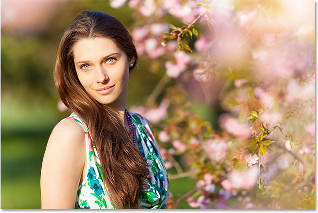
We'll use Photoshop's Levels dialog box once again to help us read and evaluate the histogram. To open Levels, I'll go up to the Image menu in the Menu Bar along the top of the screen, then I'll choose Adjustments, then Levels. I could also open Levels using the faster keyboard shortcut, Ctrl+L (Win) / Command+L (Mac). Either way works:

This opens the Levels dialog box with the histogram in the center, along with the handy black-to-white gradient bar below it:

I'll zoom in closer to the histogram so we can get a better view, and here we see that this image contains a full range of tonal values. The histogram starts at the far left, directly above black in the gradient bar below it, so we know that a few of the pixels in the image are already as dark as they can be. It extends all the way to the far right, directly above white in the gradient bar below it, telling us that some of the pixels are already as light as they can be. And, the histogram shows lots of pixels at each of the tonal values in between. If there were such a thing as an ideal shape for a histogram, this might be it:

Low-Key Images
The truth is, even though the histogram we just looked at may strike you as ideal with its full range of tonal values, in reality, it's ideal only for that specific image. Every image is different, and the tonal character of an image is greatly affected by its subject matter as well as the type and amount of light that was captured. That's why, before we start correcting images, we first need to remove any notion from our mind that there is such a thing as a standard, typical or ideal histogram. After all, you wouldn't expect a photo captured outside at sunset to share the same tonal character as a photo shot in the middle of the day.
For example, let's take a look at this second image (lighthouse at sunset photo from Fotolia):

This is an example of what's known as a low-key image, meaning that unlike the first image we looked at which showed an evenly-distributed range of brightness values from dark to light, most of the tonal range of this image naturally falls within the shadows. I'll press Ctrl+L (Win) / Command+L (Mac) on my keyboard to quickly bring up the Levels dialog box, and if I zoom in on the histogram, we can easily see that while there is some detail in the highlights and a bit more in the midtones, most of it is found in the shadows. If you had the idea in your mind that every histogram should look like the previous one, it could lead you to think that this photo is too dark and needs to be corrected, when in reality, it looks great just the way it is:

Notice that tall spike at the far left of the histogram? That's telling us that some of the darkest areas in the photo are so dark, they're being clipped to pure black, and that means we've lost detail in those areas. Normally, that would be a warning sign that the image is either underexposed or that we've darkened those areas too much in the editing process. But with this photo, it's not a problem. In fact, darkening areas to pure black helps enhance the effect of the lighthouse and the grass silhouetted against the setting sun. We don't need (or even want) detail in those areas, so darkening them to pure black was not a "mistake" but rather a good creative choice:

Here's another example of an image that was purposely shot low-key (low-key portrait photo from Fotolia):

Just looking at this image, you would expect to see its histogram bunched up in the shadows, and if I bring up the Levels dialog box, sure enough, we see exactly that. There's even less detail in the highlights and midtones than what we saw in the lighthouse photo, and while we're not seeing any shadow clipping this time, it's still extremely dark overall. Again, you may be tempted to "correct" this image if you thought that every histogram should look like that first one, but would it really make sense to try and force this photo to look like it was shot outdoors on a sunny afternoon? Of course not. Just as with the lighthouse image, the overly dark tone is well-suited for this type of photo. Remember, it's the image that shapes the histogram, not the other way around, and knowing how to recognize the natural tonal character of an image is every bit as important as knowing how to use Photoshop's editing tools:

High-Key Images
The opposite of a low-key image is a high-key image, where the tonal range consists mostly of lighter highlight tones. While low-key images are often dramatic and intense with striking contrast, high-key images are softer and more subtle. Here's an example of a high-key image (winter mist photo from Fotolia):

With its predominantly lighter tones and lack of any real contrast, this high-key image conveys a sense of peacefulness and tranquility. What do you think the histogram for this image will look like? Well, most of the photo is made up of very light tones, so right away, we know that we should expect to see the histogram bunched up into the highlights. There's a few darker areas in the trees, the dock and along the ground, but with so much of the image in the highlights, it's possible that our eyes are being tricked into seeing those areas as darker than they really are. In fact, that's exactly what's happening. The histogram, which doesn't suffer from the limitations of our eyesight, shows that we have virtually no shadow detail at all. This image is made up almost entirely of midtones and highlights. Yet, just as with the low-key images we looked at, the tonal characteristics of this image match its subject matter. We could, if we wanted to, push those darker areas down into the shadows just to make the histogram look more impressive, but the image itself would suffer. We'd be making it worse, not better:

High-key techniques are often used in beauty and fashion photography as a way to smooth out the model's skin by reducing or removing unwanted details. Our eyes see differences between light and dark pixels as detail, so as we push the entire tonal range up into the highlights, more and more of the detail disappears (high-key beauty photo from Fotolia):

Since the background in this photo is pure white, it's no surprise that when we look at the histogram, we see a tall spike on the far right telling us we have clipping in the highlights. In a more "typical" image, that spike could mean that the photo was overexposed or that we've brightened the highlights too much in the editing process. In this case though, with an image that was purposely shot high-key, it's a technical and creative choice, not a problem that needs to be corrected:

The goal of this tutorial was simply to show that there really is no such thing as a typical or ideal histogram. Every image is different, so every histogram will be different. Some photos will naturally favor the shadows, others the highlights, and while the histogram may be shouting, "Something's not right here!", the image itself may be saying, "No, don't listen to him, everything's good." An essential skill for us as retouchers is knowing how to tell the difference between a problem that needs correcting and what is simply the natural tonal character of the image.
Now that we've looked at some examples of different types of images, in the next tutorial, we'll take our first big step into the world of professional-level image correction by learning how to improve the tonal range of an image using a Levels image adjustment in Photoshop!